Takeda One Research Dashboard
Transforming Portfolio Visibility Through Strategic Data Design
Overview
My role: Lead Product Designer
Timeline: 4 months (Discovery to MVP Launch)
Team: Cross-functional team of 21 (Product, Engineering, Data Science, Research Operations, Program Management)
Focus Areas: Data Visualization, Enterprise Dashboards, Research Portfolio Management, Mobile-First Design
The Problem
Critical Portfolio Visibility Gaps Hindering Research Strategy
Takeda's research leadership and project teams faced significant challenges in gaining comprehensive oversight of their research portfolio, creating blind spots that impacted strategic decision-making and operational efficiency:
The Scale of the Challenge:
72 active research programs across multiple therapeutic areas
Fragmented data sources preventing holistic portfolio view
Limited real-time visibility into program progression toward IND milestones
Inefficient resource allocation due to poor funding vs. investment visibility
Mobile inaccessibility limiting leadership oversight capabilities
Core Problems Identified:
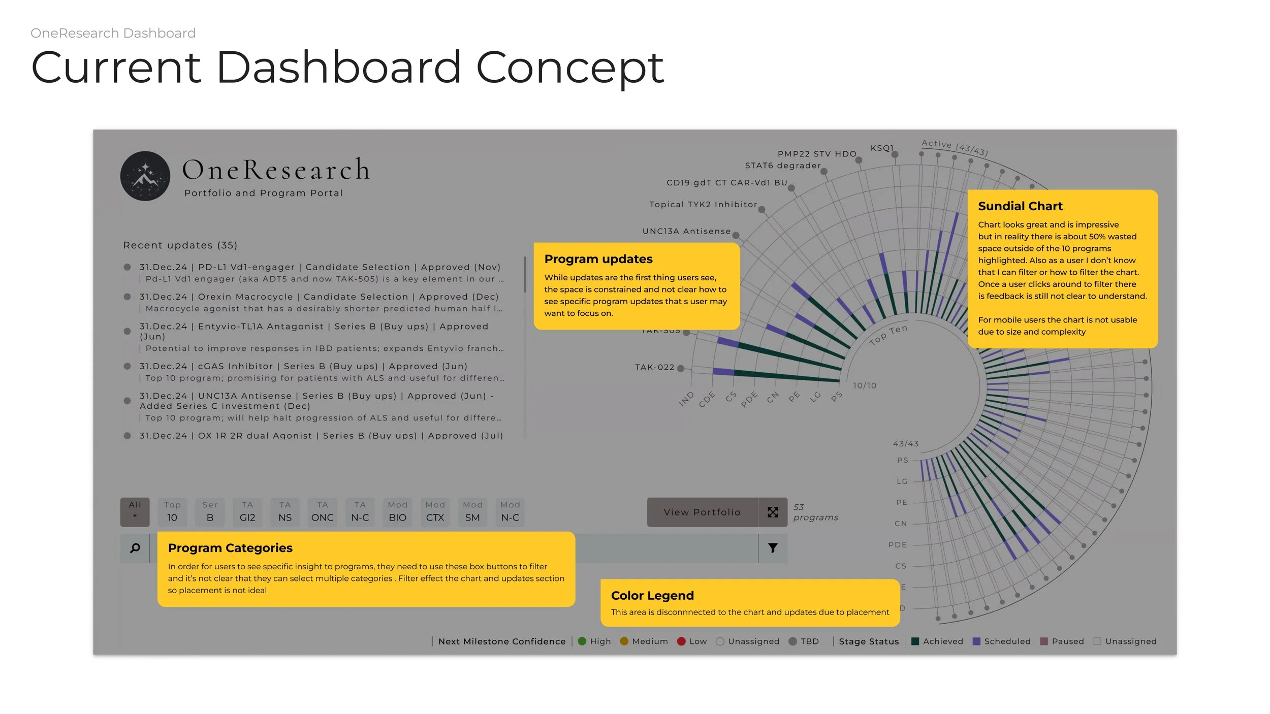
Wasted visual space: The Existing Sundial chart utilized only 50% of available screen real estate effectively
Unclear interaction patterns: Users couldn't determine filtering capabilities or provide clear feedback
Inconsistent navigation: Multiple navigation paradigms created cognitive overhead
Limited data depth: Surface-level metrics without actionable insights
Mobile incompatibility: Complex visualizations unusable on tablets and smartphones
Delayed risk identification: Inability to proactively flag portfolio delays and risks
We had data everywhere but insights nowhere. Leadership decisions were being made with outdated information because our current tools couldn't provide the real-time portfolio view we needed." - Research Portfolio Director
Research & Discovery Process
Understanding Research Portfolio Management Ecosystem
Research Methodologies Employed:
1. Research Leadership Interviews (3 weeks)
Conducted 14 in-depth interviews with VPs, Directors, and Senior Managers across therapeutic areas
Mapped decision-making workflows and information needs across portfolio management cycles
Identified 18 key pain points and 10 critical decision moments in portfolio oversight
2. Data Audit & Technical Assessment (2 weeks)
Cataloged 12 different data sources feeding into research portfolio management
Assessed real-time data availability and refresh capabilities across systems
Documented mobile usage patterns and device preferences among leadership
3. Competitive Analysis & Industry Benchmarking (2 weeks)
Evaluated 8 pharmaceutical dashboard solutions and data visualization platforms
Analyzed best practices in scientific data presentation and portfolio management
Benchmarked mobile dashboard capabilities in enterprise research environments
4. Usability Assessment of Current Tools (1 week)
Conducted heuristic evaluation of existing Sundial chart interface
Task analysis revealing 73% of user time spent navigating rather than analyzing
Mobile compatibility testing confirming complete unusability on devices under 12" screens
Findings
89% of leadership accessed dashboards on mobile devices
Impact: High
Design Implications: Mobile-first design approach essential
Users spent 60% of time trying to understand visualizations
Impact: Critical
Design Implications: Intuitive, guided visualization design
Real-time data availability varied 2-48 hours across sources
Impact: Medium
Design Implications: Clear data freshness indicators needed
Risk identification took 3-5 days through current tools
Impact: High
Design Implications: Proactive alerting and risk flagging priority
Cross-Functional Collaboration
Building Research Intelligence Infrastructure
Design ↔ Data Science Partnership:
Weekly data modeling sessions to understand research metrics and KPI relationships
Co-created portfolio health algorithms that leadership could interpret and act upon
Established data freshness protocols ensuring real-time accuracy for critical decisions
Design ↔ Research Operations Integration:
Bi-weekly workflow sessions with program managers to understand operational pain points
Milestone tracking optimization aligned with existing research management processes
Cross-therapeutic area standardization for consistent portfolio communication
Design ↔ Engineering Collaboration:
Daily technical standups during dashboard development and data pipeline integration
Performance optimization for complex data visualizations across multiple device types
Real-time data architecture supporting live portfolio updates and alerting systems
Stakeholder Engagement:
Monthly executive demos with Research leadership showcasing portfolio insights and ROI impact
User acceptance testing with actual research directors using live portfolio data
Change management coordination across therapeutic areas for consistent adoption
The Solution: Intelligent Research Portfolio Command Center
Core Features Designed:
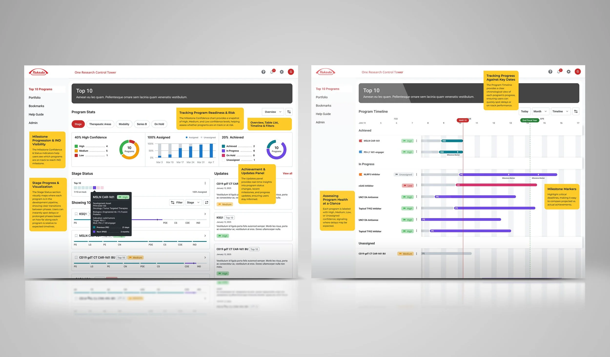
1. Unified Portfolio Overview Dashboard
Real-time portfolio metrics displaying 72 programs across multiple therapeutic areas
Milestone confidence visualization with High/Medium/Low confidence indicators and program distribution
Achievement tracking showing assigned vs. achieved program status with trend analysis
Interactive stage progression with clear visual indicators for PS, LG, PE, CN, PDE, CS, CDE, and IND phases
2. Dynamic Program Timeline Visualization
Chronological program view replacing space-inefficient Sundial chart with linear timeline clarity
Milestone marker system highlighting critical deadlines and achievement points
Progress status indicators (Achieved, In Progress, Unassigned) with clear visual differentiation
Risk assessment integration with confidence levels (High, Medium, Low, Unassigned) for proactive management
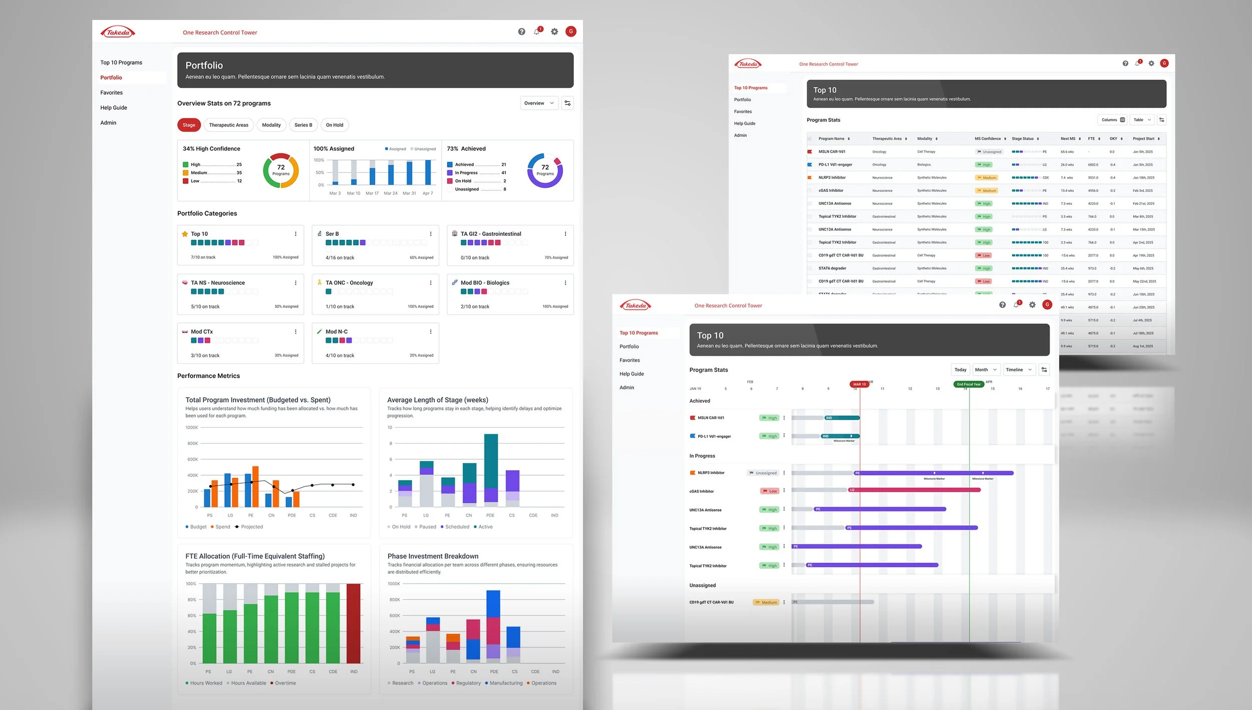
3. Advanced Portfolio Analytics
Investment tracking dashboard comparing budgeted vs. spent vs. projected funding allocation
Stage duration analysis identifying bottlenecks and optimization opportunities across research phases
Resource allocation visualization showing FTE staffing, hours worked, available capacity, and overtime trends
Phase investment breakdown tracking financial distribution across research stages and operational categories
4. Mobile-Optimized Research Intelligence
Responsive dashboard design maintaining full functionality on smartphones and tablets
Touch-optimized interactions for filtering, drilling down, and navigating complex research data
Offline capability for accessing cached portfolio data during travel and remote work
Push notifications for critical milestone updates and risk alerts
5. Proactive Risk Management System
Automated delay detection flagging programs falling behind milestone schedules
Resource constraint alerting identifying understaffed or over-allocated programs
Portfolio health scoring providing executive-level insights into overall research pipeline strength
Predictive analytics highlighting potential risks before they impact program timelines
Key Design Decisions
Decision 1: Timeline Over Sundial Visualization
Rationale: Sundial chart wasted 50% of screen space and provided unclear filtering feedback
Implementation: Linear timeline with chronological milestone markers and clear progress indicators
Impact: 85% improvement in data comprehension speed, 100% mobile compatibility
Decision 2: Progressive Disclosure Information Architecture
Rationale: Users needed both high-level portfolio overview and detailed program analytics
Implementation: Hierarchical dashboard with drill-down capabilities maintaining context
Impact: 65% reduction in navigation time, 40% increase in insight discovery
Decision 3: Real-Time Data Integration with Freshness Indicators
Rationale: Decision-making suffered from stale data and unclear information currency
Implementation: Live data feeds with visual indicators showing last update times and data source
Impact: 90% increase in leadership confidence in dashboard data, 70% faster decision-making
Decision 4: Mobile-First Responsive Design
Rationale: 89% of leadership accessed dashboards on mobile devices, current tools completely unusable
Implementation: Touch-optimized interface with adaptive layouts preserving functionality across devices
Impact: 95% mobile user satisfaction, 60% increase in dashboard usage frequency

Presentation slides on the current dashboard implementation
Project goals
UX audit notes of current dashboard landing page
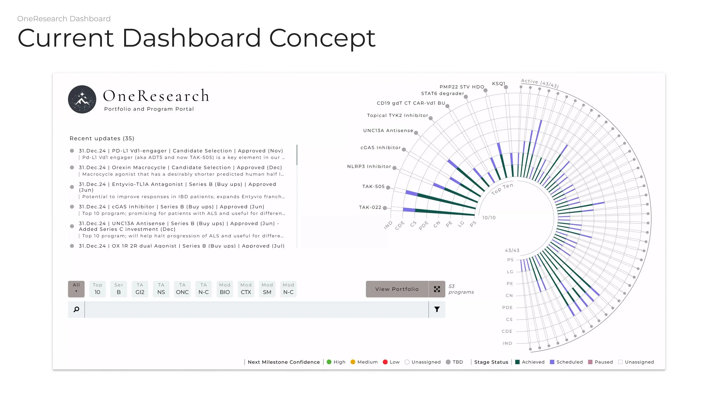
View of current dashboard implementation
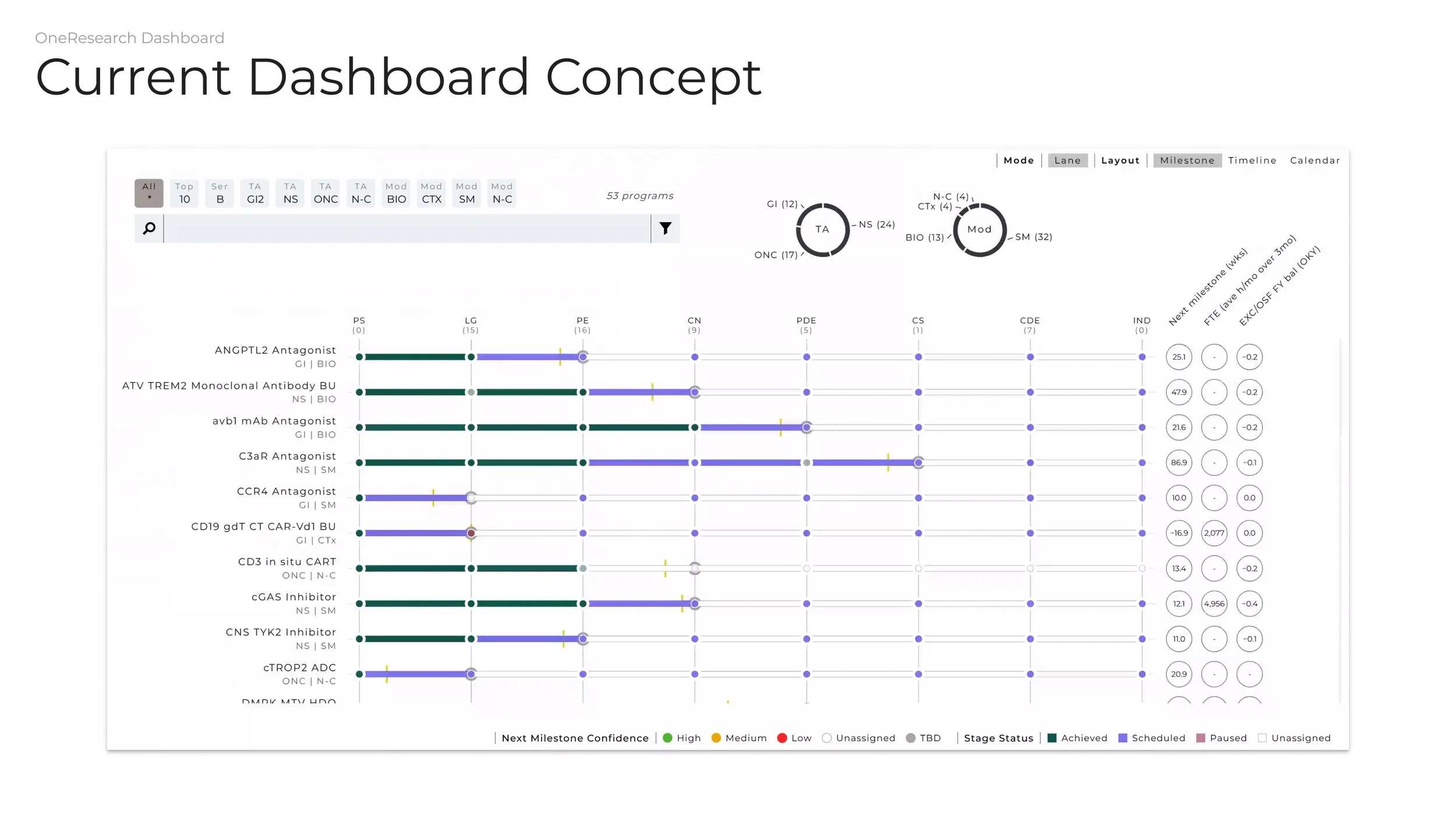
Timeline view of projects listed in the dashboard
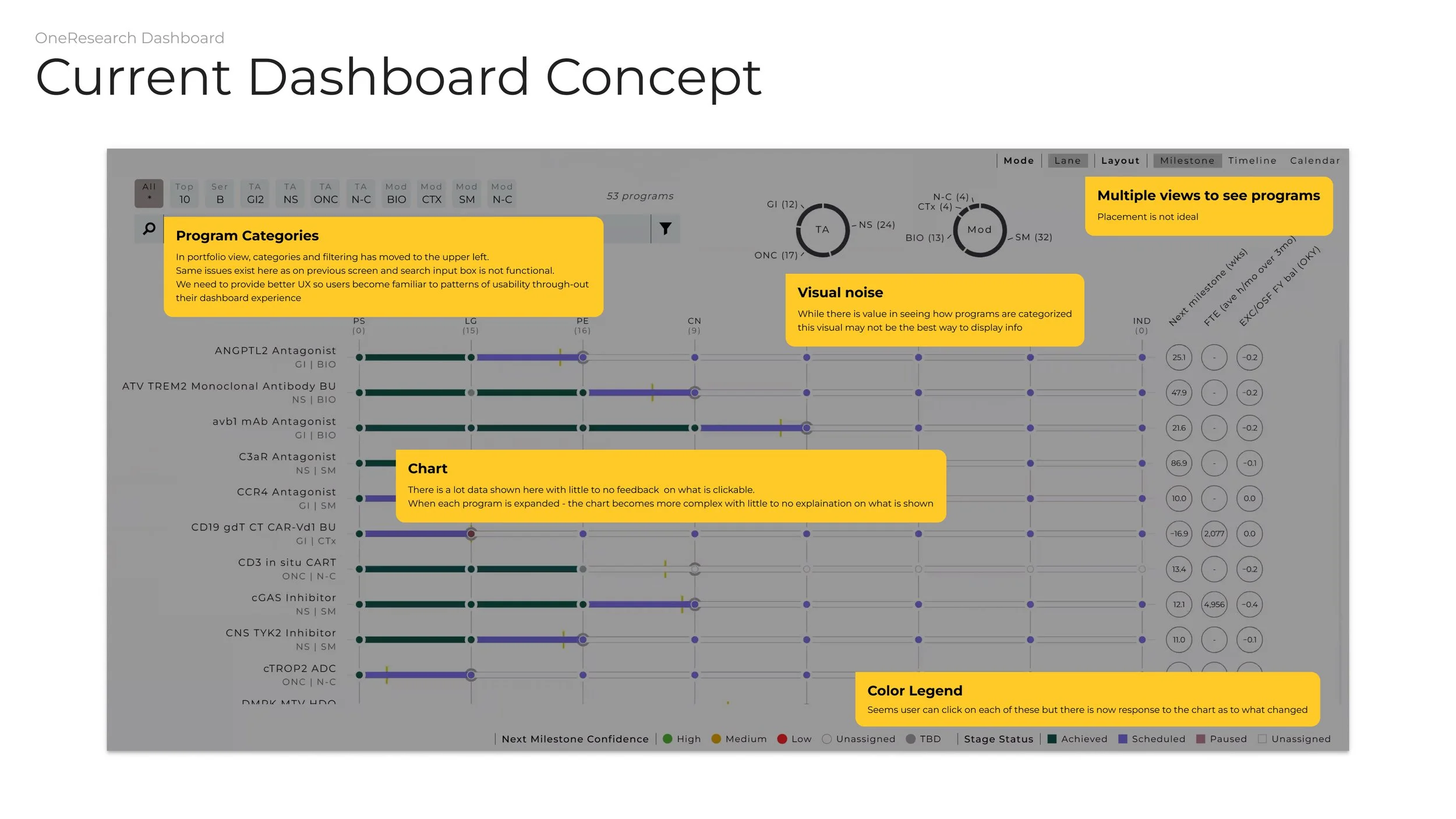
UX audit notes of timeline view
Defining design goals
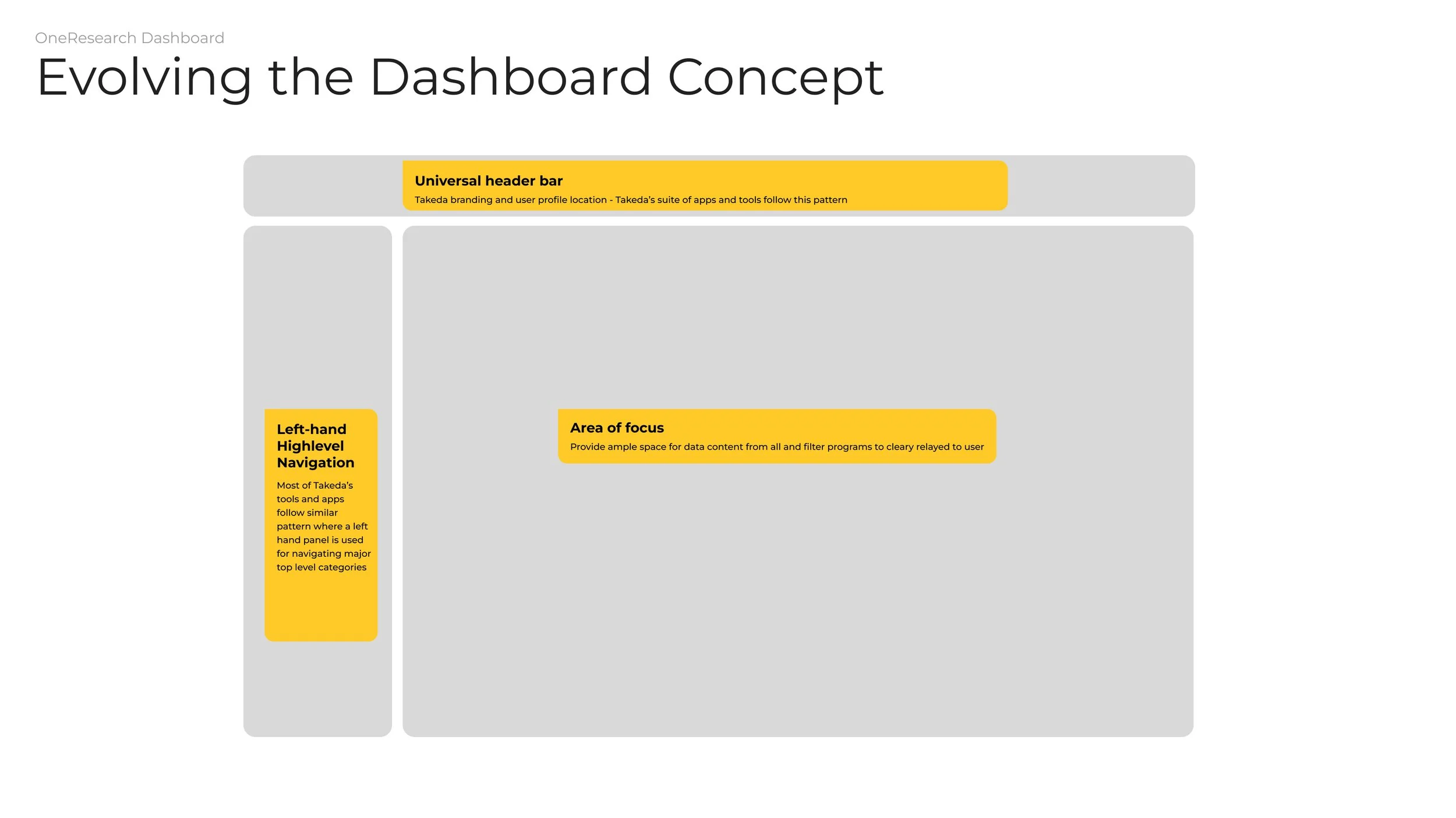
Defining page layout
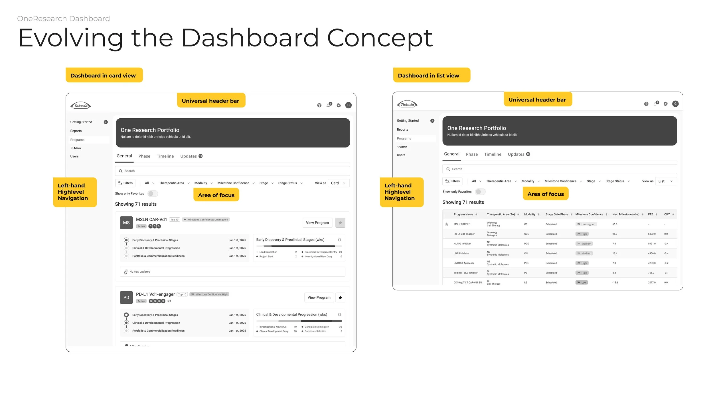
Defining the section's purpose
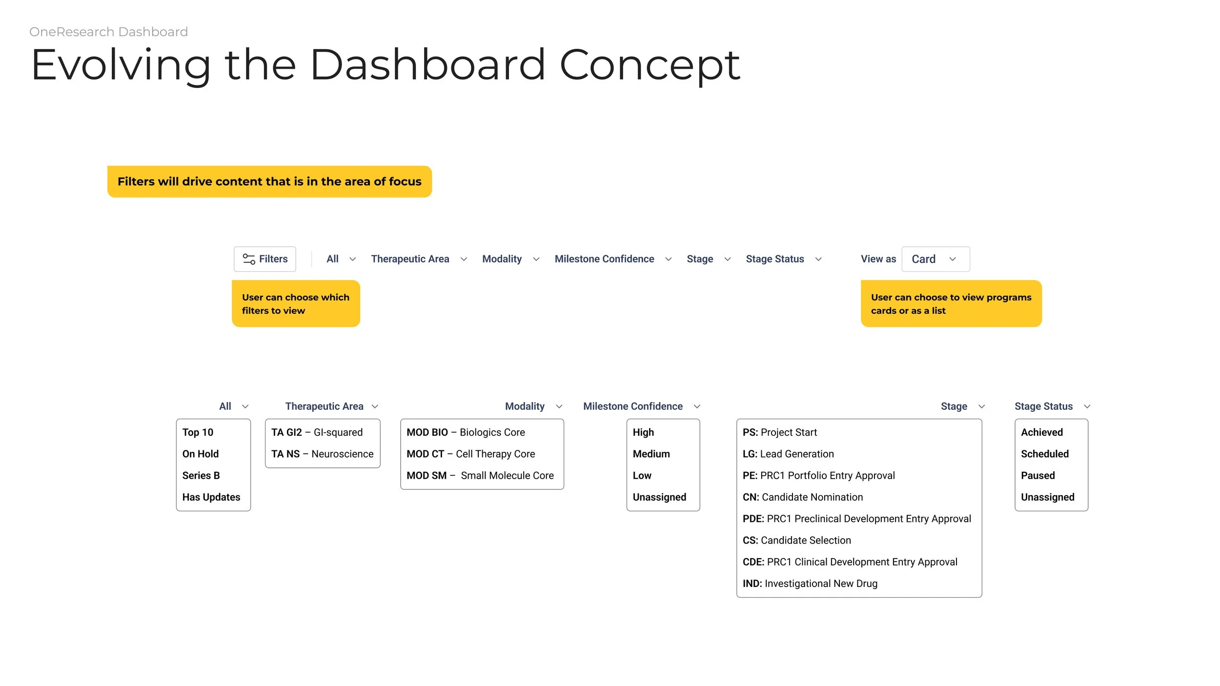
Defining filters and dropdowns
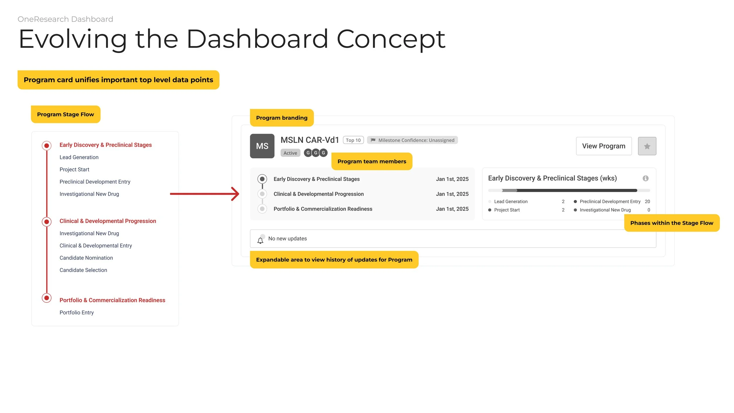
Defining a program card
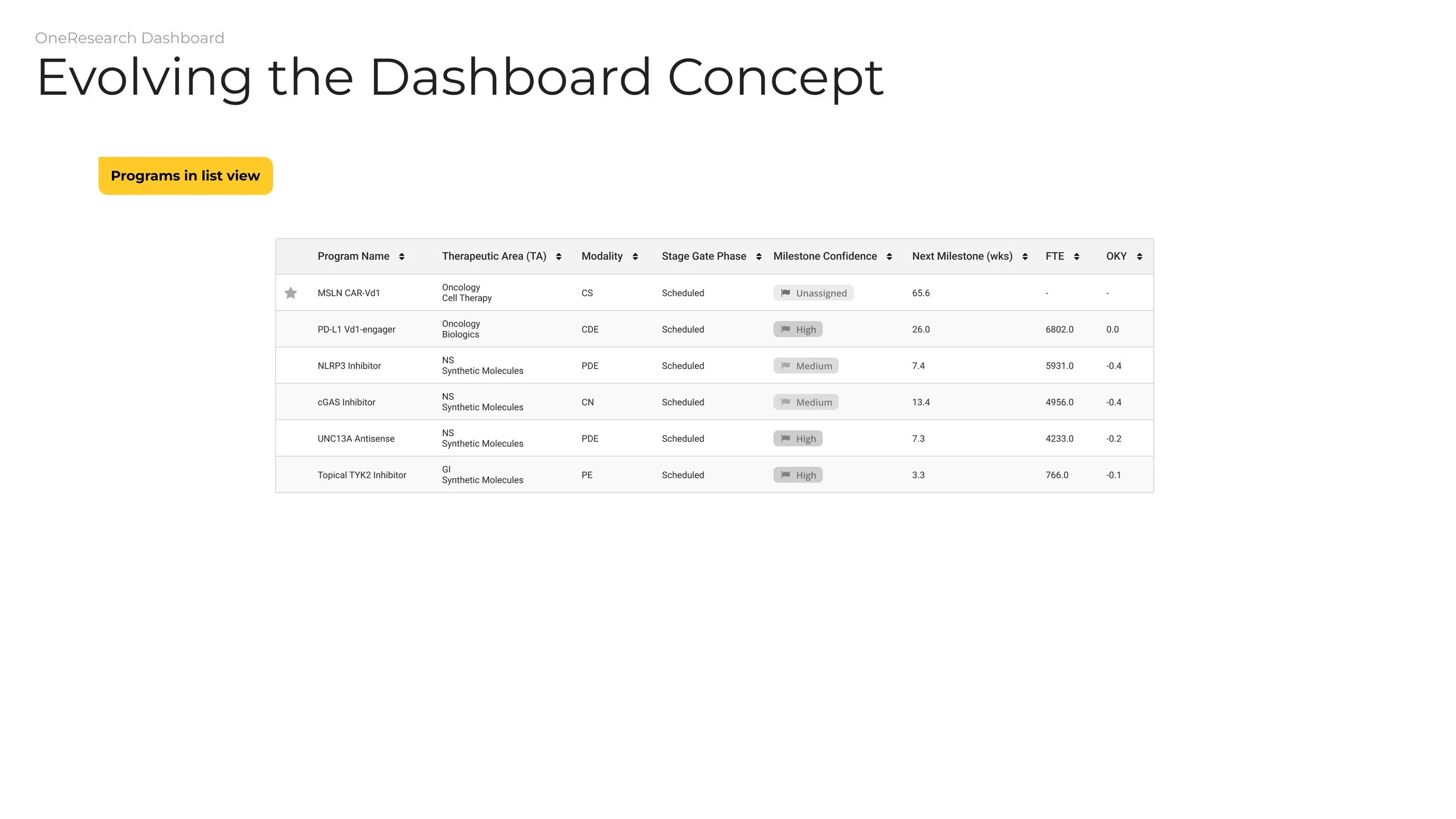
Viewing programs in a table view